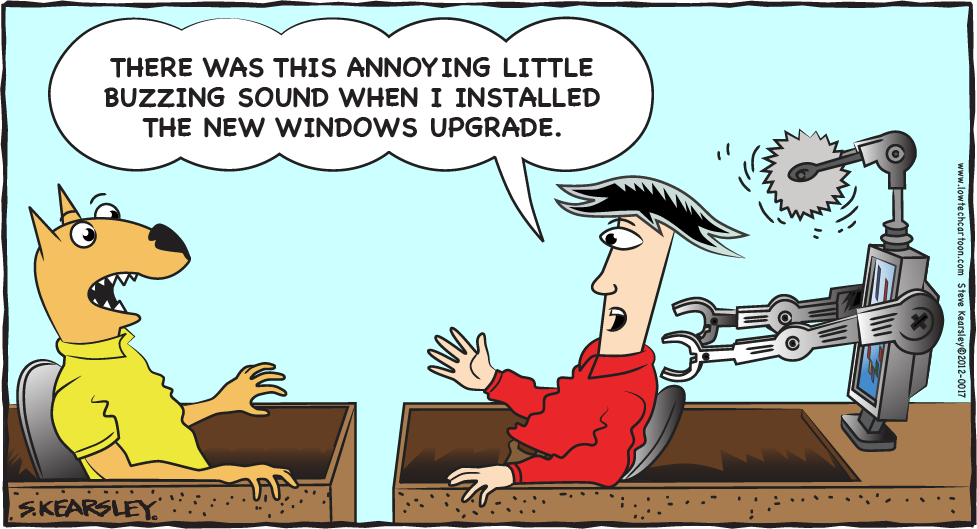
The new Windows UI is confusing, it is an awkward mishmash that cuts the interface in two. Users that like the new touch-friendly Metro GUI will not like the old touch-hostile desktop underneath. Users who rely on the old Windows desktop will not like having to navigate Metro to find settings and apps they can locate in the older version.

Finally a person that puts some real work into a blog. I do like what you have done with the webcomic.